

The Composite Momentum helps to understand three things:
- When to step on the treadmill
- Which is the direction you have to take
- Where you might want to go down or prepare for descent
The Composite Momentum is an oscillator with a bandwidth ranging from +100 to -100. Like other indicators, it can be displayed in different ways and with a particular focus on certain aspects. The first display mode is similar to a MACD, therefore plotting it with a line and with its average.
The goal of the Composite Momentum is to help identify the basic trend of the market momentum, the turning points, the excess situations and situations with a particularly profitable potential.
A view implementation, visible in the chart below, relates to dangerous levels. Together with the equilibrium line placed on zero, areas of excess are placeable between +50 and +80 upward and -50 / -80 downwards.
Momentum indicates the strength of the market by measuring the rate of change of prices rather than their actual levels. One of the most important factors of this oscillator – due to its construction and to the fact that the momentum is still the second derivative of the price – is its movement, which sometimes is related to the market and sometimes is in advance..
We take it as an example a market where supply is low the price slide.
As soon as the new bullish movement starts, the Composite Momentum will generate a buy signal given by the fact that the last marked price is higher than that of “x” previous days. With the advance of the bull market phase, the oscillator will indicate trend and speed with which prices are moving upward. It should be noted, however, that the Composite Momentum stops rising even in the case where prices continue to rise. This happens when the increase in prices over the “x” previous days remains unchanged: the prices then will continue their ascent while the oscillator will stop climbing. As the first slowdown in the pace of price growth shows, the oscillator will slowly begin to fall resulting in a first bearish divergence (rising prices, albeit with less force than before, oscillator already downhill).
There are four levels of intuitive interpretation:
- Direction upward or downward
- Position above or below the zero line
- Upward or downward turns
- Excesses in the bands between +50 and +80 and -50 to -80
- Direction upward or downward
The position on the upside or downside of the Composite Momentum can be used as an interesting indication of the market trend.
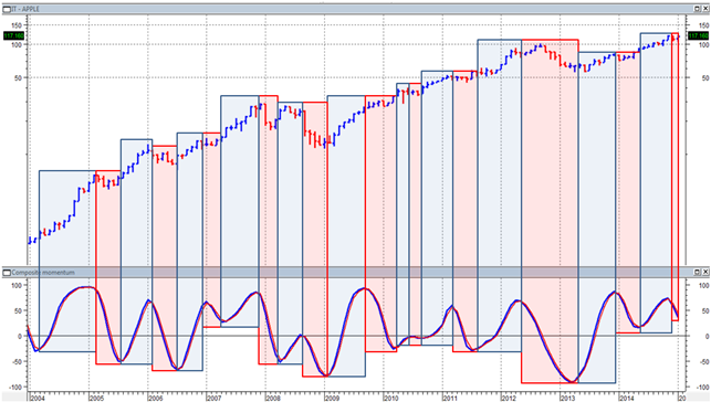 – APPLE, quarterly data. Below the Composite Momentum (in blue) and its weighted average (in red). The blue and red squares show the direction to the upside or downside of the CM, which is directly linked to the trend of the stock –
- Position above or below the zero line
The position of the Composite Momentum above or below zero is extremely important. A CM above zero indicates an upward trend, while below zero indicates a downward trend, hence, the breakout of the zero line can also be interpreted as a change of trend.
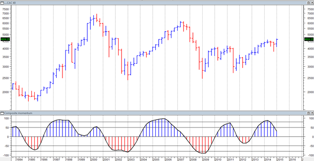 – CAC40 index, monthly data. Below the Composite Momentum: blue when it is above 0 and red when it is below 0. Notice how positions above and below zero match positive and negative phases of the index –
- Upward or downward inflections
The Composite Momentum junctures represent levels of great importance as they signal with extreme precision reverse trend, acceleration and excess points.
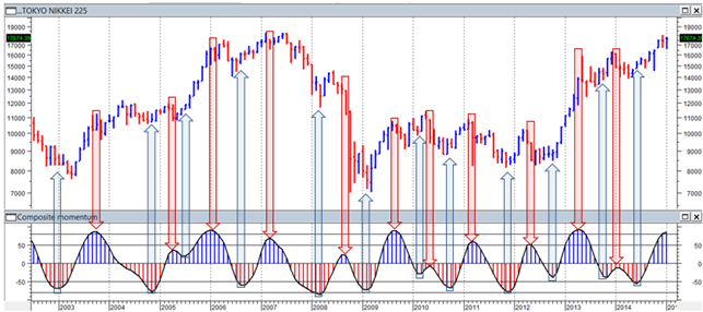 – NIKKEI 225 Index, monthly data, the CM below. The arrows indicate the upward (in blue) or downward (in red) junctures of the CM –
The levels of inflection, which often differ from those identifiable by the normal techniques (Gann, Elliot, Fibonacci etc.), have a remarkable technical and operational valence. In the following chart it can be noted how the changing trends (2008 2009, 2011) are always reported and confirmed by the failure of one of these levels of support/resistance, which is often not recovered from the market as proof of its importance.
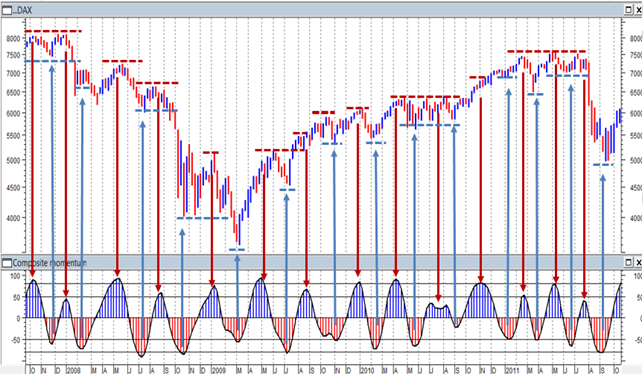 – DAX Index weekly data. Flexes of the Composite Momentum (below) are resistance levels (red dotted lines) as for the negative flexes (red arrows) and are support levels (blue dotted lines) as for the positive flexes (blue arrows) –
- Excesses in the bands between +50 and +80 and -50 to -80
A further interpretation element of the Composite Momentum is represented by the excesses found in the bands between 50/80 and -50 / -80.
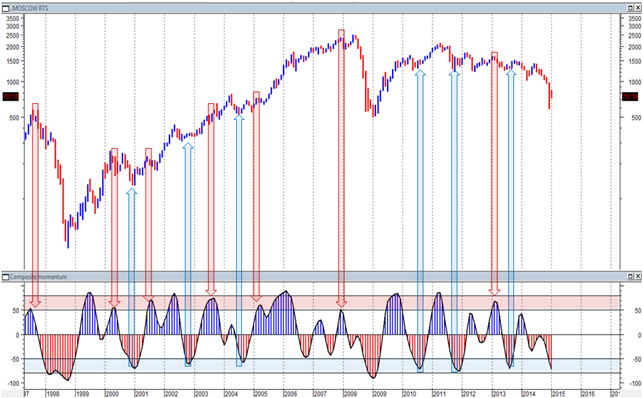 – RTS Index (Russia), monthly data. Below the Momentum Composite highlighting the bands + 50 / + 80 (in red) and -50 / -80 (in blue). The red and blue arrows indicate the cases in which the CM registers of the flexed within the bands. Notice how points of coincidence are those in which the market’s minimum and maximum takes place –
Particularly high readings of the Composite Momentum (above +80 and below -80) must be seen within the underlying trend. An extreme reading, positive or negative in an uptrend in downtrend, implies a particularly strong underlying impulse of the market. On a short period, it can certainly indicate an excess and it increases the likelihood of a consolidation, but at the same time, it leaves the possibility of a continuation of the strong trend in the direction of the peak of momentum open. Conversely, both a high reading at the end of a phase of rebound of a downtrend and a particularly low at the end of a correction in an uptrend, indicate particularly interesting entry in the direction of the prevailing trend.
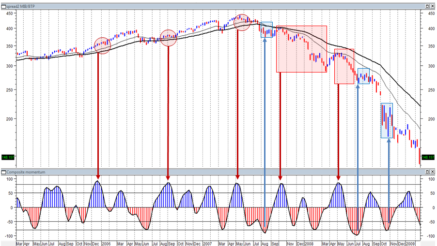 – The spread MIB:BTP on a weekly timeframe and two exponential moving averages to 20:40 periods, lower the Composite Momentum –
The chart clearly shows that in the maximum area over 80 and the smallest area below the -80 the Composite Momentum assumes a different meaning depending on the direction of the trend in which they act.
The three maximums recorded by the CM in 2006 and 2007 (highlighted by the red arrows) have shown small corrections (highlighted by the red boxes) because the trend was strongly bullish. The example also applies to the three minimum of 2007 and 2008 (shown with blue arrows), which resulted in short rebounds only (highlighted by blue boxes) because the trend was negative.
The opposite goes for the maximum of 2008 (shown by the red arrows), which entered into a market dominated by a bearish trend, they reported major adverse movements (marked by the red boxes).


